Experience
What problem am I solving and who am I solving it for?
We solve important problems and improve lives. Our work has had a positive influence and impact on many government and commercial projects on websites, desktop applications, mobile apps, and texting programs.
Smokefree.gov
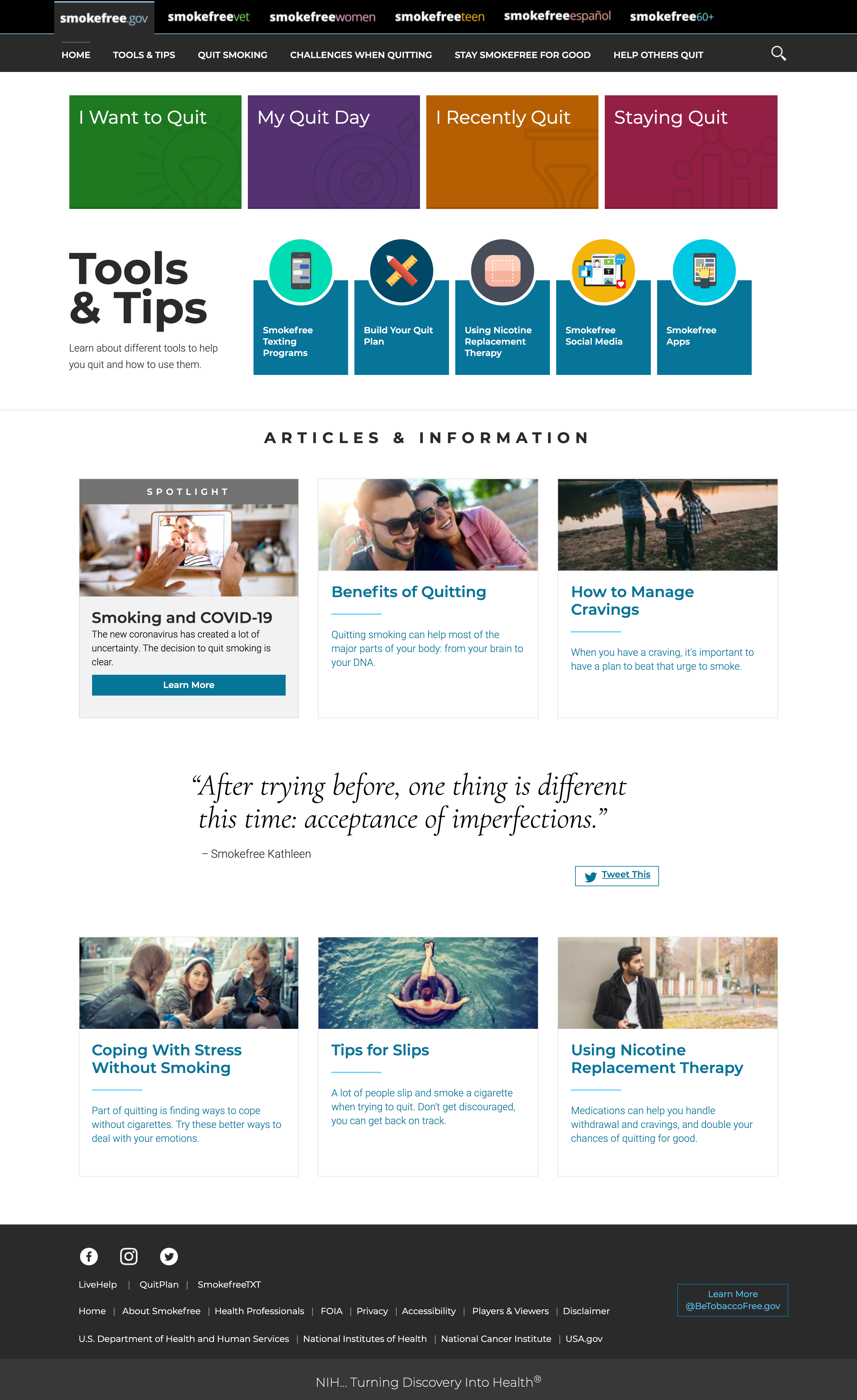
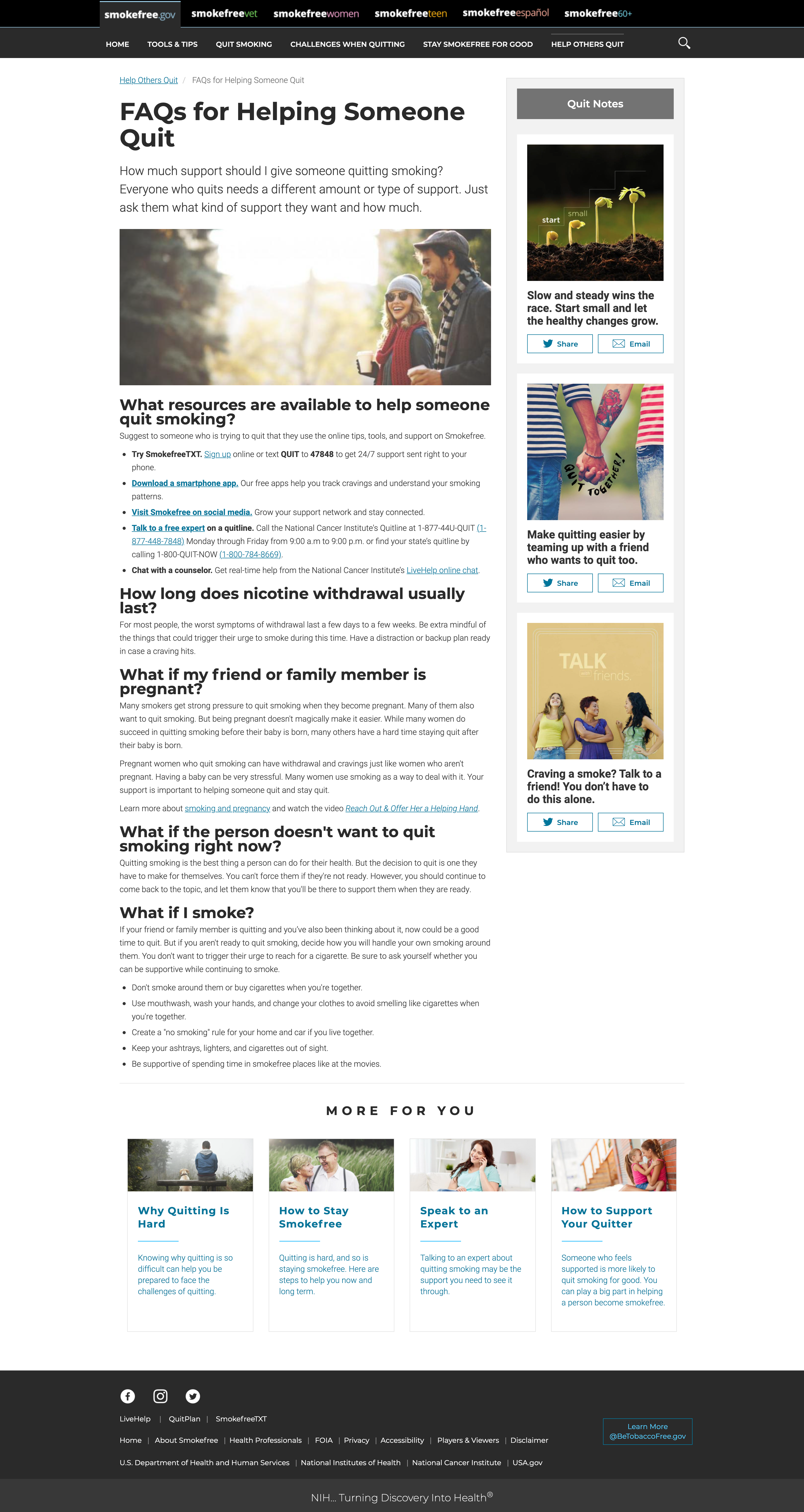
National Institutes of Health (NIH) website designed to help individuals quit smoking using evidence-based researched. Platforms include websites, apps, and text message programs specifically tailored to veterans, women, teens, Spanish-speaking, and 60+ user groups.
PROBLEM
A legacy process did not use a user-centered design approach to problem solving. Assumptions were made, but not tested or validated with real users so their decisions were not user-informed.
Smokefree.gov is one of a suite of online tools that use evidence-based research to help people quit smoking. Ironically, the program was not using a user-experience approach to understand their users to guide and validate their vision, content, and usability. Each micro-site was created and managed independently and there was no unifying design, content, or messaging across the suite of digital tools and websites. The inconsistent and redundant messaging and content made it difficult to understand where to go to find the content the users needed.
SOLUTION
Before fully understanding the larger cross-program issues, I led the initial efforts to conduct usability testing on the smokefree.gov website. We worked closely with management to understand, define, and prioritize the organization goals and user needs to drive the direction. The work we performed was typically mixed-method research. The deliverables were audience and goal specific and most deliverables involved an analysis of the data and then results summary with actionable lists. The scope of involvement increased and the UX team planned and conducted many planning and research activities including:
- Usability Testing
- User Interviews
- Wireframes & Concepts
- Visual Design Comps
- Design thinking Workshops
- Information Architecture Card Sorting
- Metrics Analysis & Strategy
UX insights informed decisions that:
- Increased and more successful funnels and conversions
- Holistic approach to the suite of online tools
- Targeted priority organization and user needs
- Increased user satisfaction
- Aligned broader organization vision with online tools
IMPACT
The usability testing was a huge success and informed many new decisions and helped open the eyes of the project team on what and how user experience can help them make better decisions. Over several years, with my guidance and oversight, we used evidence-based research to improve the effectiveness of the websites, mobile apps, and quit smoking texting program. The user experience involvement grew to involve over a dozen UX specialists, who worked on almost all of the websites and apps and text messaging program. The most critical impact was the buy in from management and team members to integrate a continuous user-centered design approach to help better understand their user’s needs and align them with the project goals to prioritize their future work
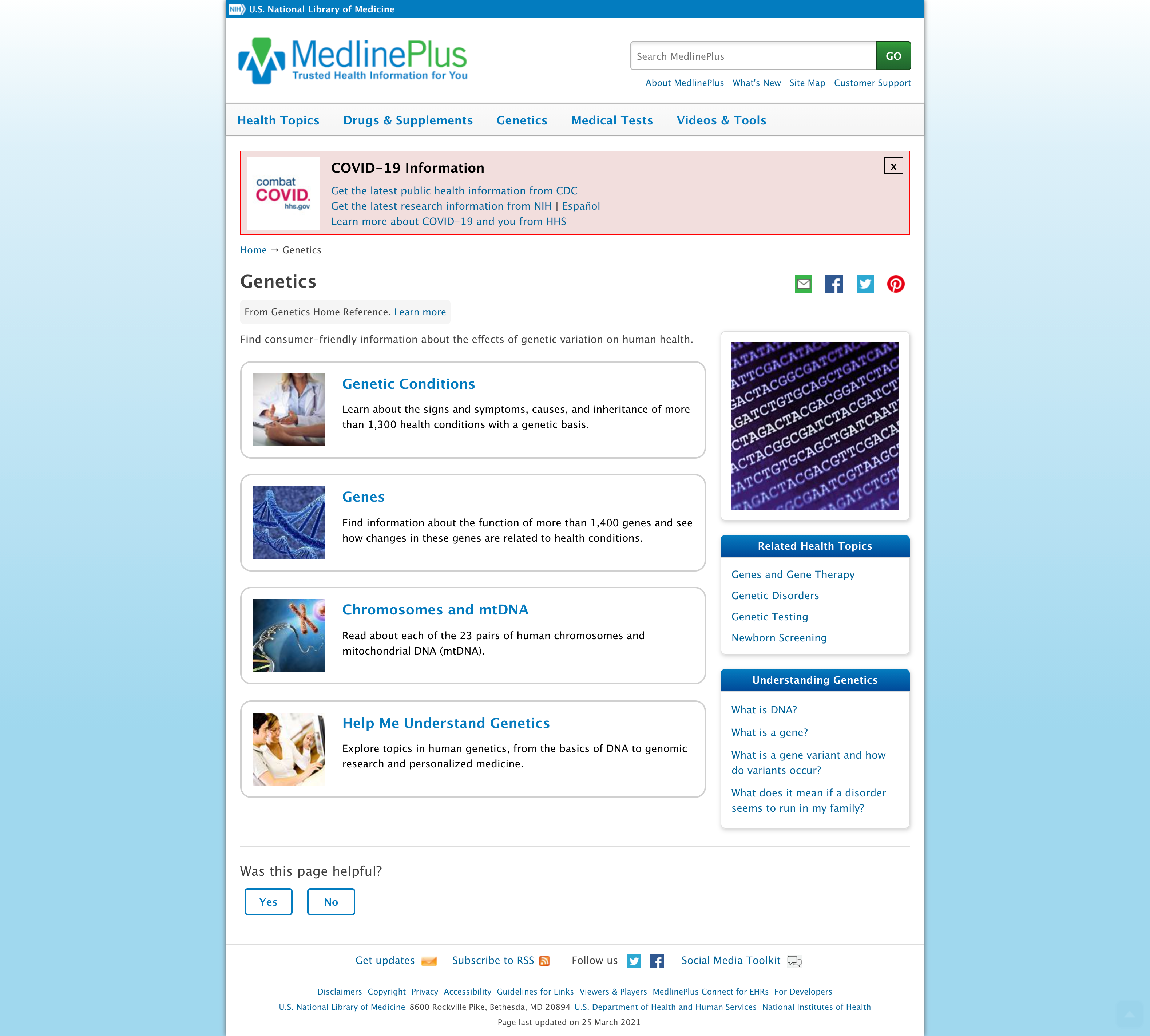
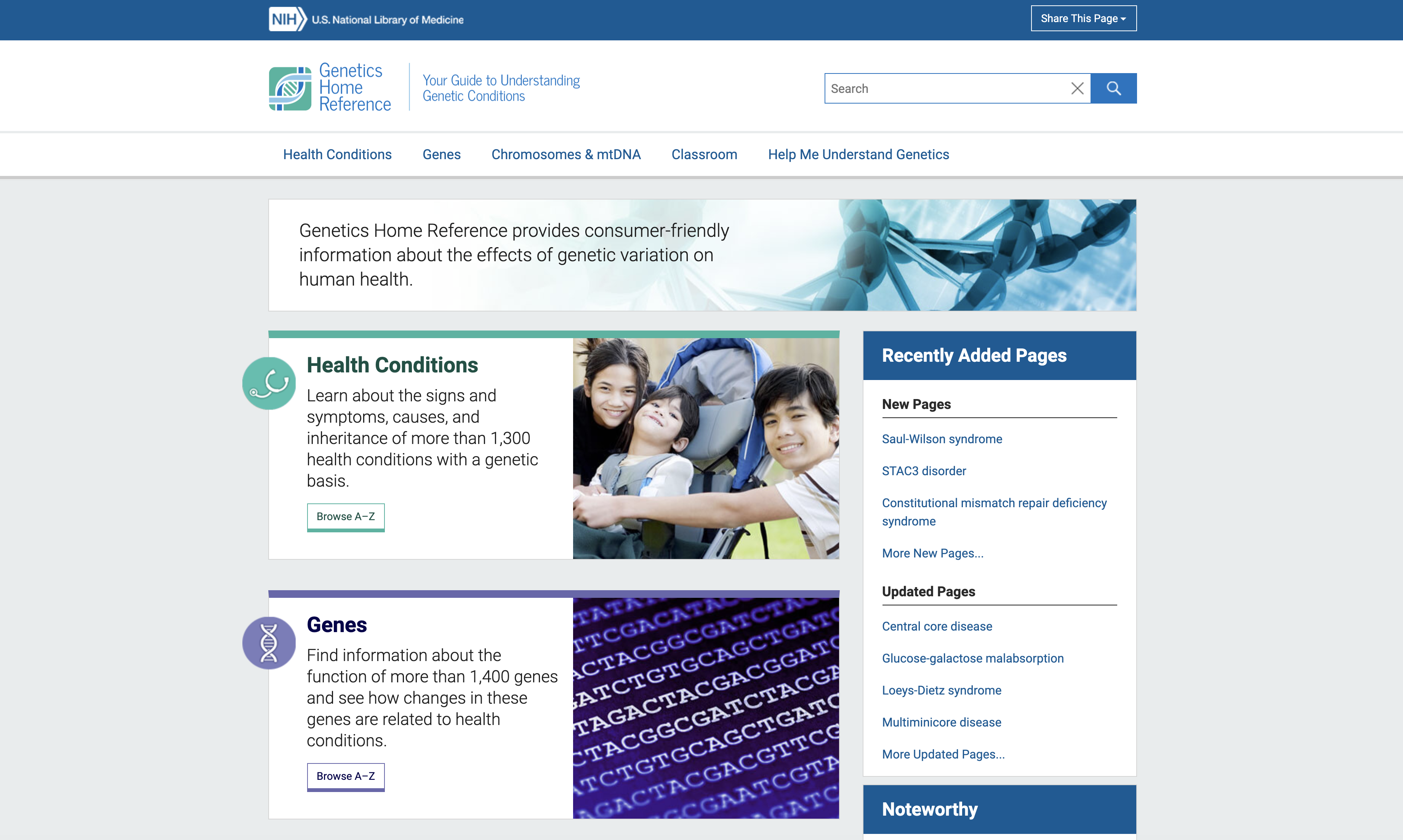
National Institutes of Health / National Library of Medicine / Genetics Home Reference
Health and Human Services (HHS) and National Institutes of Health (NIH) sponsored websites and resources to provide current, reliable and easy-to-understand information about rare genetic diseases and to support rare disease research.
PROBLEM
The Genetics Home Reference had plans to redesign their 2000-era website. The website team had requested a visual design refresh, however after a UX strategy consultation, the program agreed to add a UX strategy and research support. The redesign would have made the website look more up-to-date, however a visual refresh will not identify any problem areas based on user needs and behaviors, and organization goals.
SOLUTION
The UX support started with discovery research and a design workshop with the stakeholders and web project team to understand and prioritize the organization goals and user needs. The workshop provided a vision and a one year plan to design the website around user-research.
IMPACT
The UX team initially began conducting one-off usability tests and user interviews to learn more about the user needs and problems. As we worked closely with the team, we became more involved as a consultant to help prioritize and align these insights with their organization goals. The work evolved into a long term strategy and plan integrating a user-centered design approach to help evolve the website(s), supporting the project with information design, content, information architecture, interface design, visual design, qualitative research, and user interviews. The methodologies focused on user interviews, usability testing, and competitive reviews and content analysis. The research findings reports informed and improved our priorities, decisions, direction, and content. By facilitating stakeholder brainstorming workshops and frequent iterative reviews, we kept the client involved during the entire process. This involvement and exposure to our work helped the client understand the benefits of our approach and research. We were able to transform the way these programs approached problems; through the lens of their customers and users. The high profile work was recognized in a NNG article and led to several years of follow on work with the NIH, National Center for Advancing Translational Sciences, National Library of Medicine, and other small projects.
EPA LASSO Environmental Projection Prediction Tool Online Application

EPA developed a homegrown desktop tool, in Microsoft Excel, to help non-technical researchers create and select sets of climate change projections for their environmental research. The tool was so successful, the tool owner wanted to create a web app.
PROBLEM
The owner identified a real need in the environmental community. However, as he began the transformation he distributed it to a limited audience and discovered it was difficult to use and some of his initial assumptions did not align with actual user needs.
SOLUTION
As a UX strategist, I assessed his goals, the user needs, problems, and priorities, and what was known and what was unknown. With a limited budget, we created a lean UX plan to efficiently learn as much as we could to guide the most impactful changes. We used an iterative design process to research, design, prototype, and test. The user interviews and usability tests helped us validate out assumptions, find problems with the designs, and help better understand the user’s needs and priorities for future development.
IMPACT
Some of our assumptions were wrong and initial design ideas we not clear users. The rapid usability testing and interviews provided important insights that allowed us to make adjustments early in the process before we committed any development time. This process saved time and money and created a much better product. The result was a web application that met the user’s needs, was accessible to the public, and easy to use. The program plans to use a user-centered process in the future to engage with their user base to continuously and iteratively improve the product.
USDA The Farm Service Agency (FSA)
CONTENT PLACEHOLDER: National Institutes of Health (NIH) website designed to help individuals quit smoking using evidence-based researched. Platforms include websites, apps, and text message programs specifically tailored to veterans, women, teens, Spanish-speaking, and 60+ user groups.
PROBLEM
The Farm Service Agency (FSA) - CONTENT PLACEHOLDER
A legacy process did not use a user-centered design approach to problem solving. Assumptions were made, but not tested or validated with real users so their decisions were not user-informed.
SOLUTION
Who doesn’t want to help our farming community? Through a General Services Administration Center of Excellence (CoE) program, a customer experience team was assembled to better understand local and regional office Farm office needs, help improve regional office operations and relationships with farmers, and see if the farmer’s loan and assistance needs were being met by the local offices. The CoE’s goal was to gain insights to make informed decisions through interviews with Farmers and Farm Service Agency workers.
Over a 9 month timeframe about a dozen Customer Experience and User Experience specialists planned and coordinated six on-site visits to interview office staff and farmers throughout the United States. The insights provided a lens into the small, local offices across the nation.
Focusing on the Direct Loans program, the CoE followed a customer journey mapping model to document the current customer journey between producers and service center staff. This process provided guidance and insight to FSA leadership, the USDA Chief Information Officer (CIO) and the development teams for the FPAC Portal, Farmers.gov, and Voice of the Customer efforts.
IMPACT
The most critical lesson we all learned was that farmers did not want more technology, they wanted a relationship with their local offices. Many people in the DC offices thought that we should create more apps and websites to help expedite applications and provide more information for farmers, but in the end, the most important thing to these farmers was face-to-face interactions, communications, and relationships.
Countless dollars could have been spent to give the farmers what everyone thought they wanted, but instead we provided upper-level management in DC with customer-driven priorities, goals, and needs. These insights informed their decisions to better meet their customer’s (farmers in need of financial aid) needs.

Other Projects
U.S. Surgeon General Know the Risks
E-Cigarettes & Young People Report Website
Climate.gov
USGCRP Global Indicator Report Website
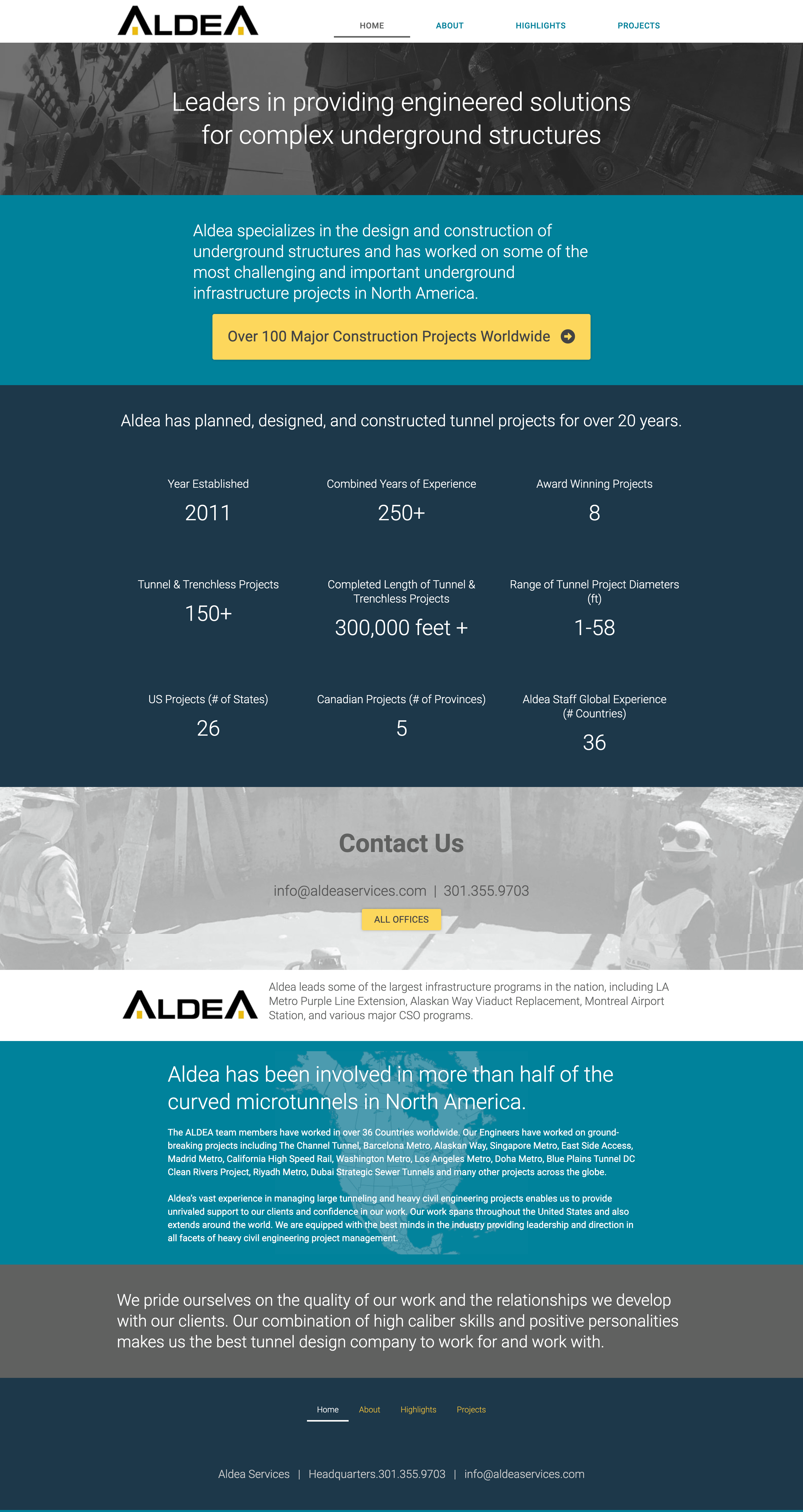
Aldea Services
Tunnel Engineering Website
Wellsky / ClearCare Desktop and Mobile Application
Home Care Software Solutions for Agencies Website
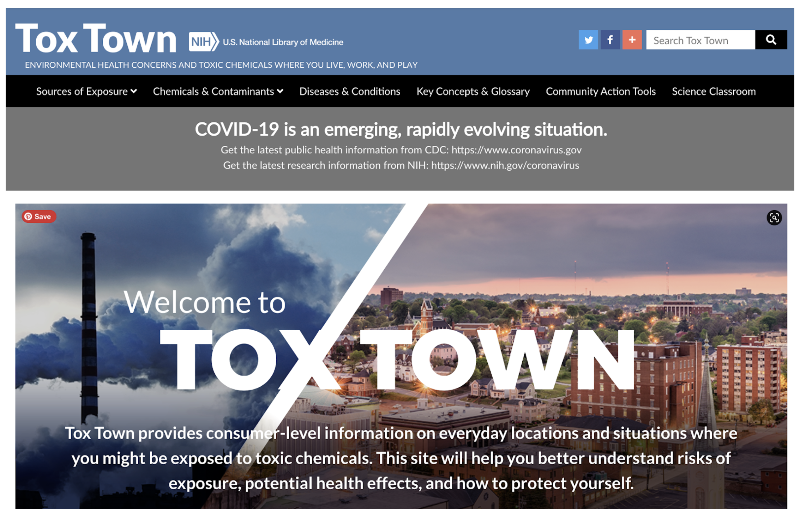
Tox Town
NIH National Library of Medicine Website
Website was recently removed due to government reorganization
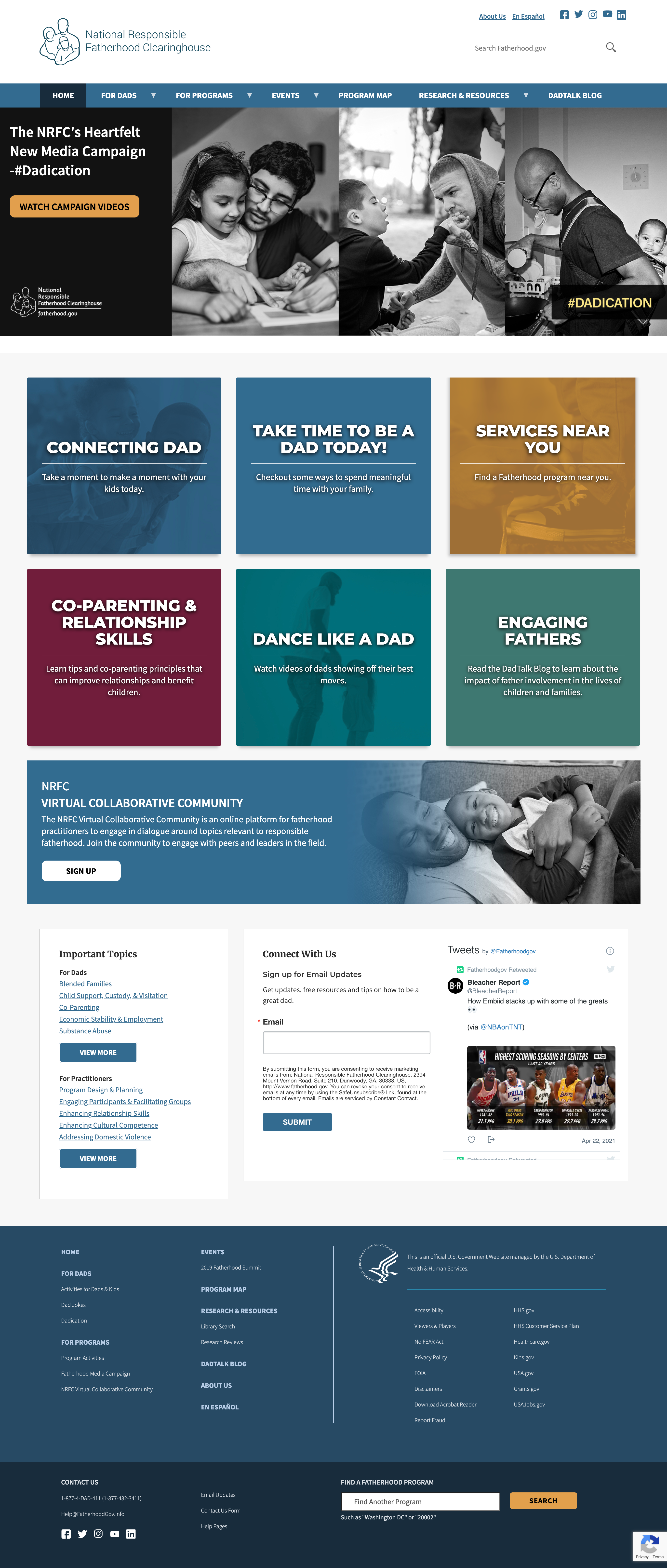
Fatherhood.gov
National Responsible Fatherhood Clearinghouse
Heath and Human Services Sponsored Website
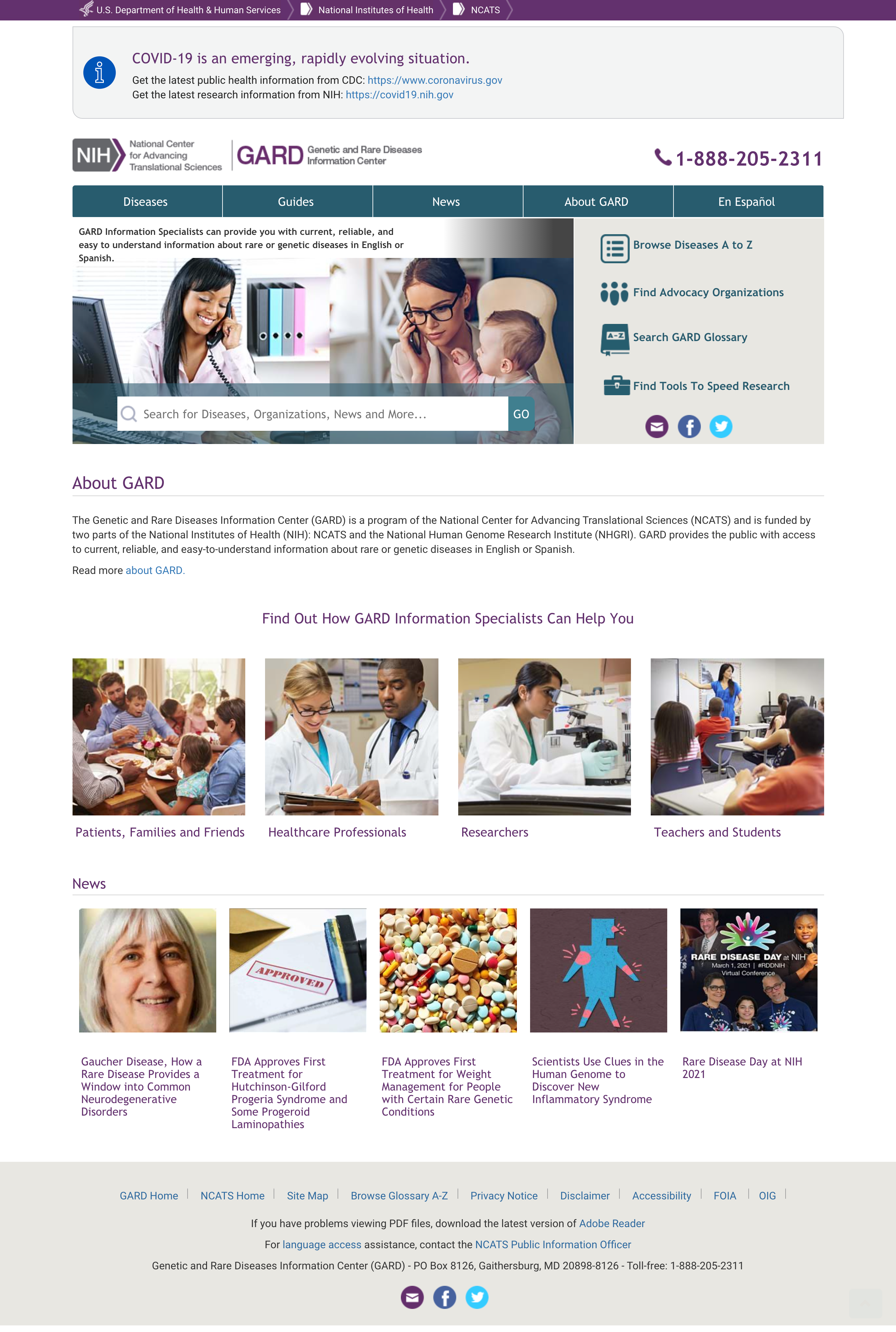
Genetic and Rare Diseases Information Center
Program of NCATS and Funded by NIH Website
Genetics Home Reference
NIH Sponsored Website
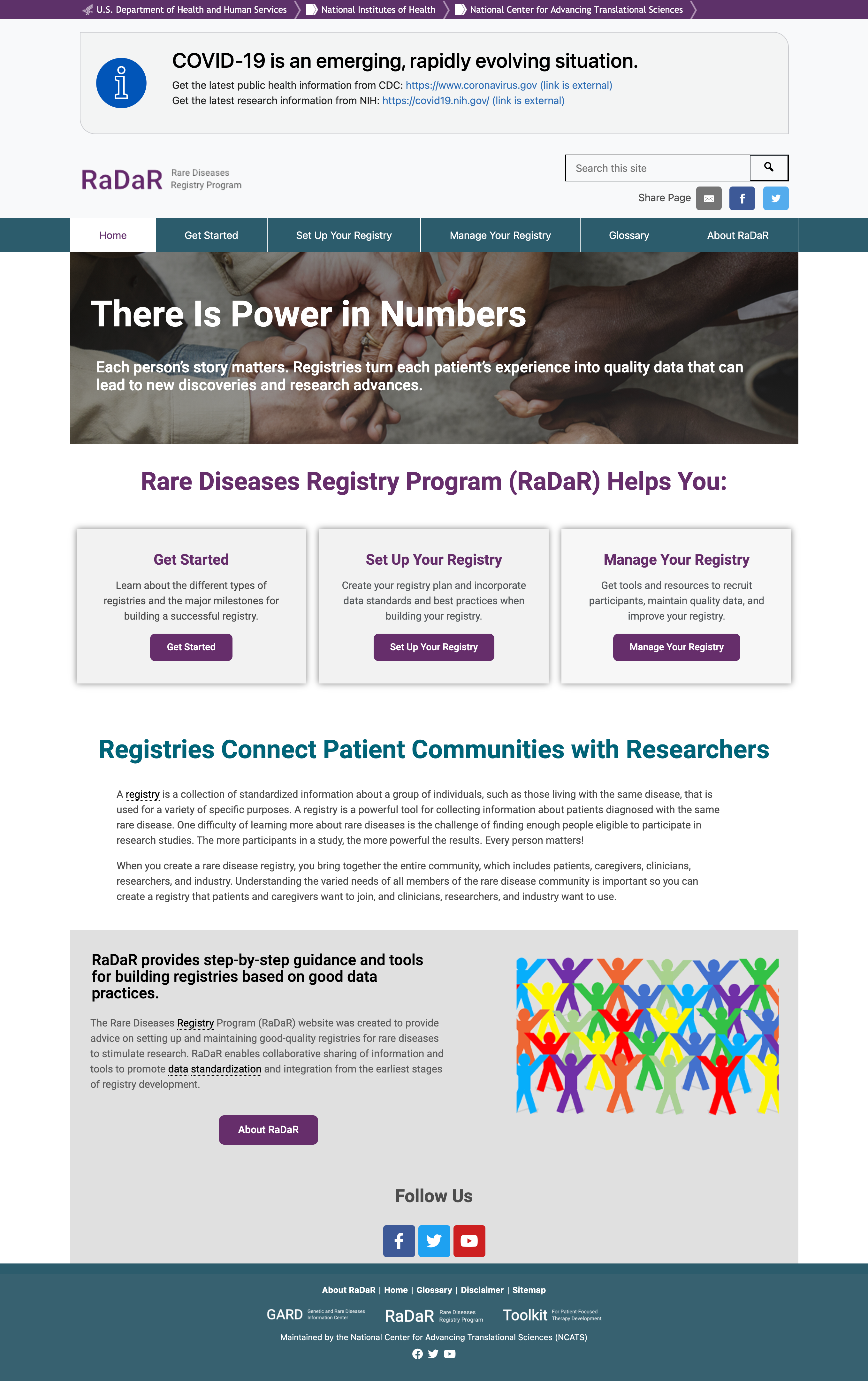
Rare Disease Registry Program
HHS Sponsored Website

Interested in working together? Get in touch!
brad.aabel@cycleux.com
© 2021 Brad Aabel • All Rights Reserved


